

There are two kinds of people on earth. One who incline towards blue when the skies are grey. For obvious reasons. The other who despise blue when the skies are grey because they think blue only makes the whole affair bluer. or bleak.
Good news is, this post is for both. The first kind will truly enjoy this, because it shows you how to make a fairly moody color cozy and the shades of blue to pick. The second set will probably take a minute to rethink their bias because this is anything but blue!
FreedomTree launched their Chasing Monsoon collection recently and we got chatty about what is it that makes blue tick when the skies are grey! And most importantly, what kind of blue.
When you are blue, are you sad or tranquil?
And that really depends on what blue are we talking about. With blue, you are always treading a fine line between tranquil and sad. Cozy and bereft. We blame the color but we often end up with the wrong blue. Like havin’ a bad boyfriend, and givin’ love a bad name sister (read me in Dolly voic
e please)
Haha, jokes apart, if you get the right blues, and use them right, you could very happily tread the path of tranquil-cozy and that is what FreedomTree and I am here to tell you.
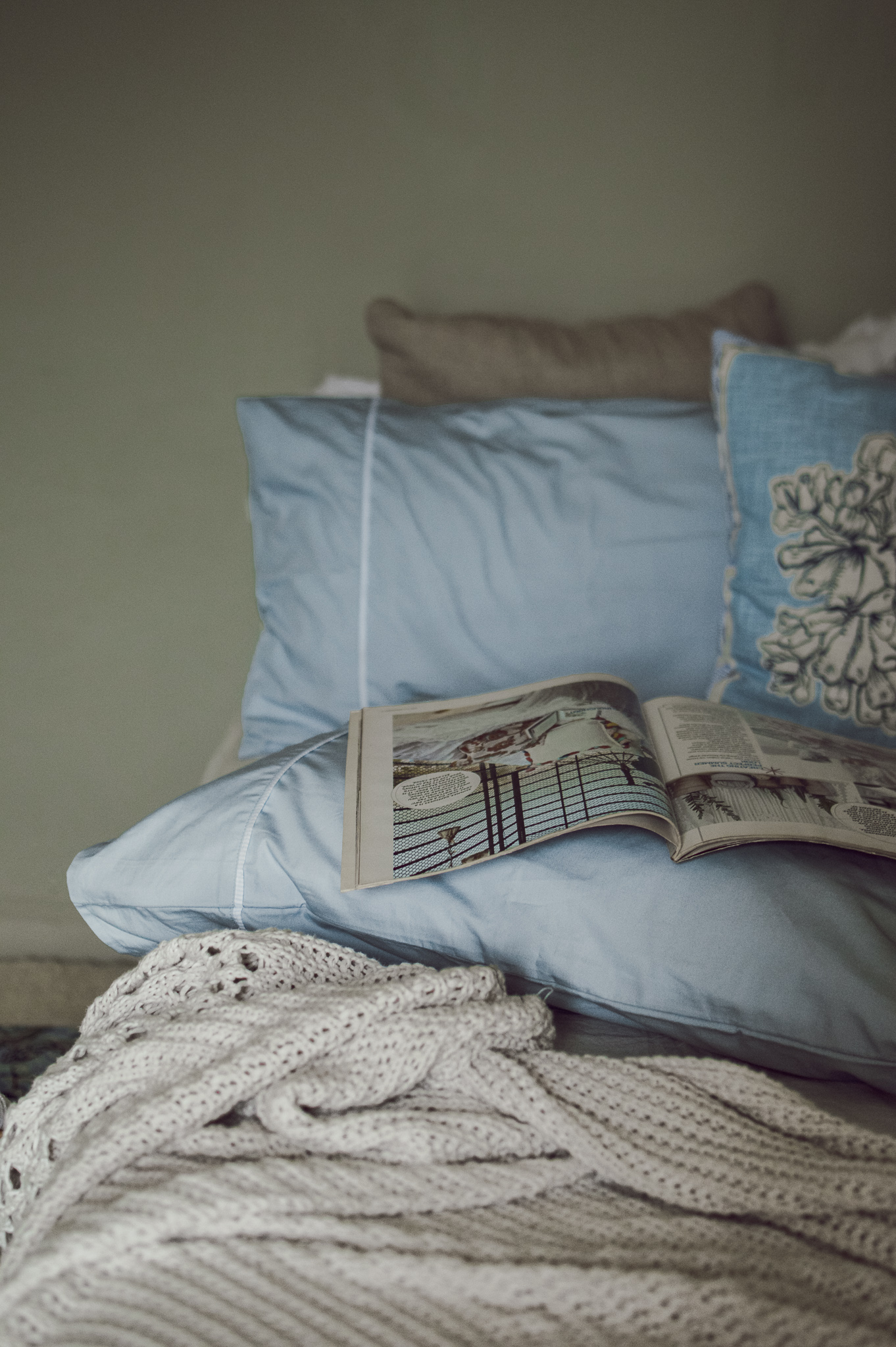
The sky blue at midday is the most beautiful warm blue. Use it in your furnishings for a dollop of cozy
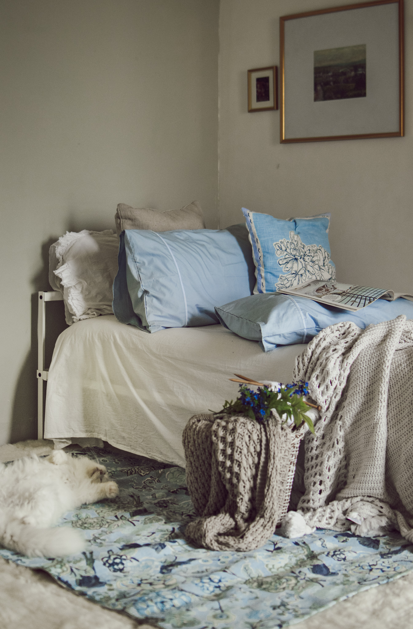
In here, I used their soft blue pillow shams, ginger flower cushion and layered our rug with the Damask Rose rug. I love that their Damask Rose rug incorporates the exact combination I spoke of on the paragraph above. Makes me look very smart.
P.S. That ginger flower cushion has such a beautiful story! Please read on their website. I love reading what designers think before a product comes to life.
Go darker in tableware for mood. A deep teal, turquoise and a touch of white is perfect

If you want to mimic the beautiful moody weather outside your window inside your home, you can do it with decor and dinnerware. As opposed to paler, warm blues, opt for cooler, deep blues. You can also opt opt for teal. They lend tons of mood to your home and looks beautiful too. Offset with grey and a touch of orange and green. You want mood, not elegiac mood!
Love the whimsical, handmade, rustic dinnerware from Freedom Tree’s wonderland collection. They are also great for hosting an alfresco lunch party. Pair them with either blue or deep green and lots of wild flowers!
For our table, to elaborate on the subject, I am using the Wonderland round bowl, wonderland mugs and wonderland side plates
Get inspired by chintz. Pick sky, cobalt or indigo with white for your accent pieces
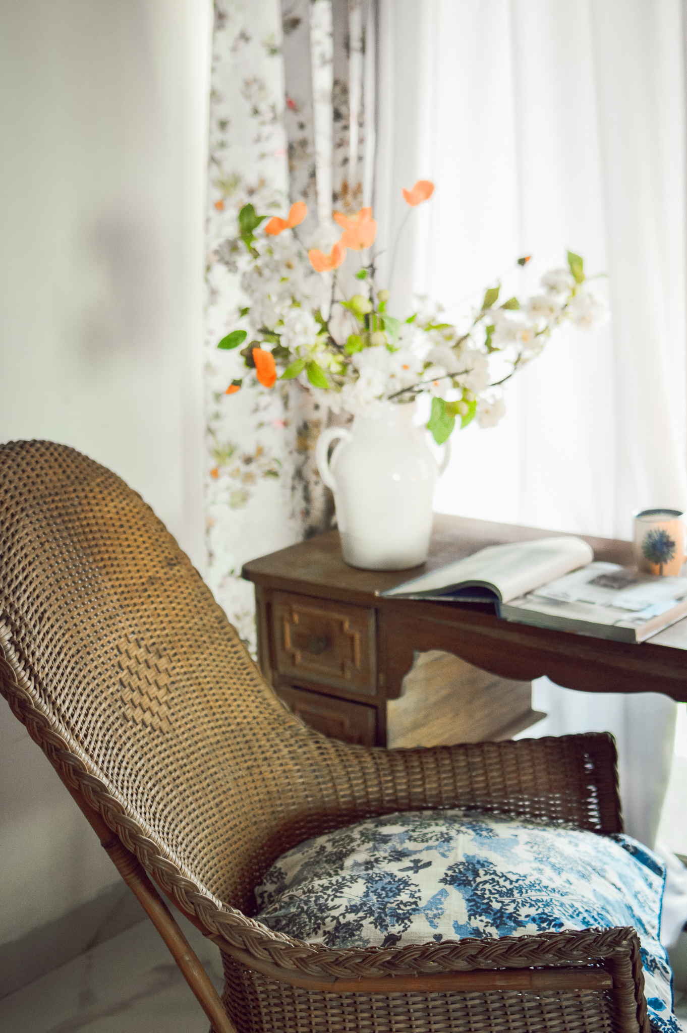
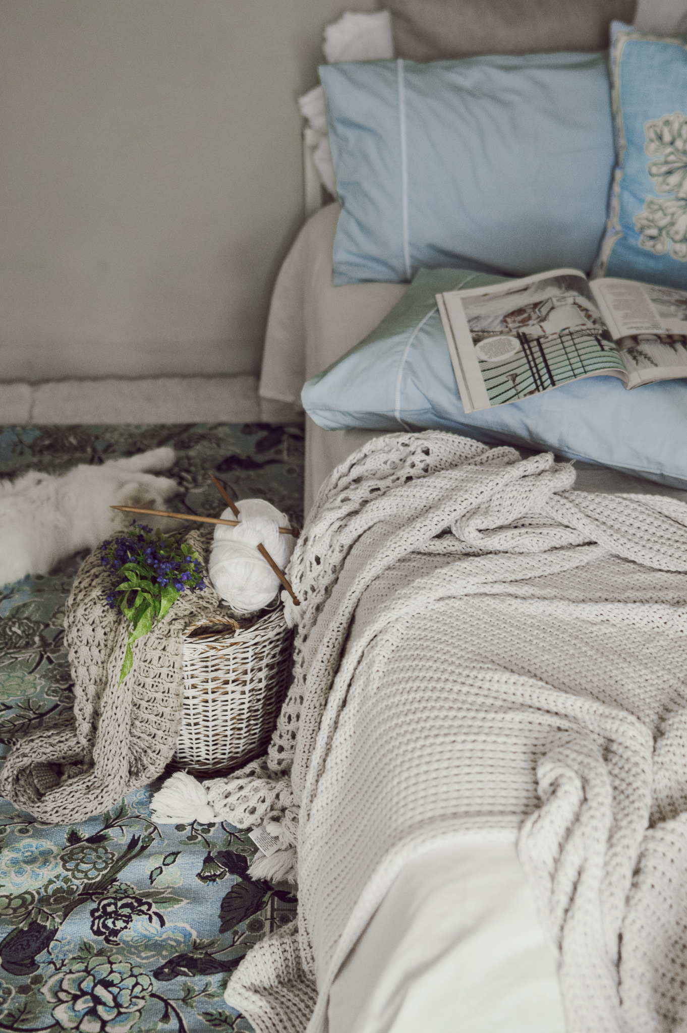
If you have a corner that is wood and wicker heavy and you’d like to add a little blue, I’d recommend cobalt and indigo with white. And make it Chintz-y! Reminiscent of wrap-around porches and lazy, balmy days, the Divi Divi cushion cover is absolutely perfect to bring in a little cheer to your corner minus the gloom.
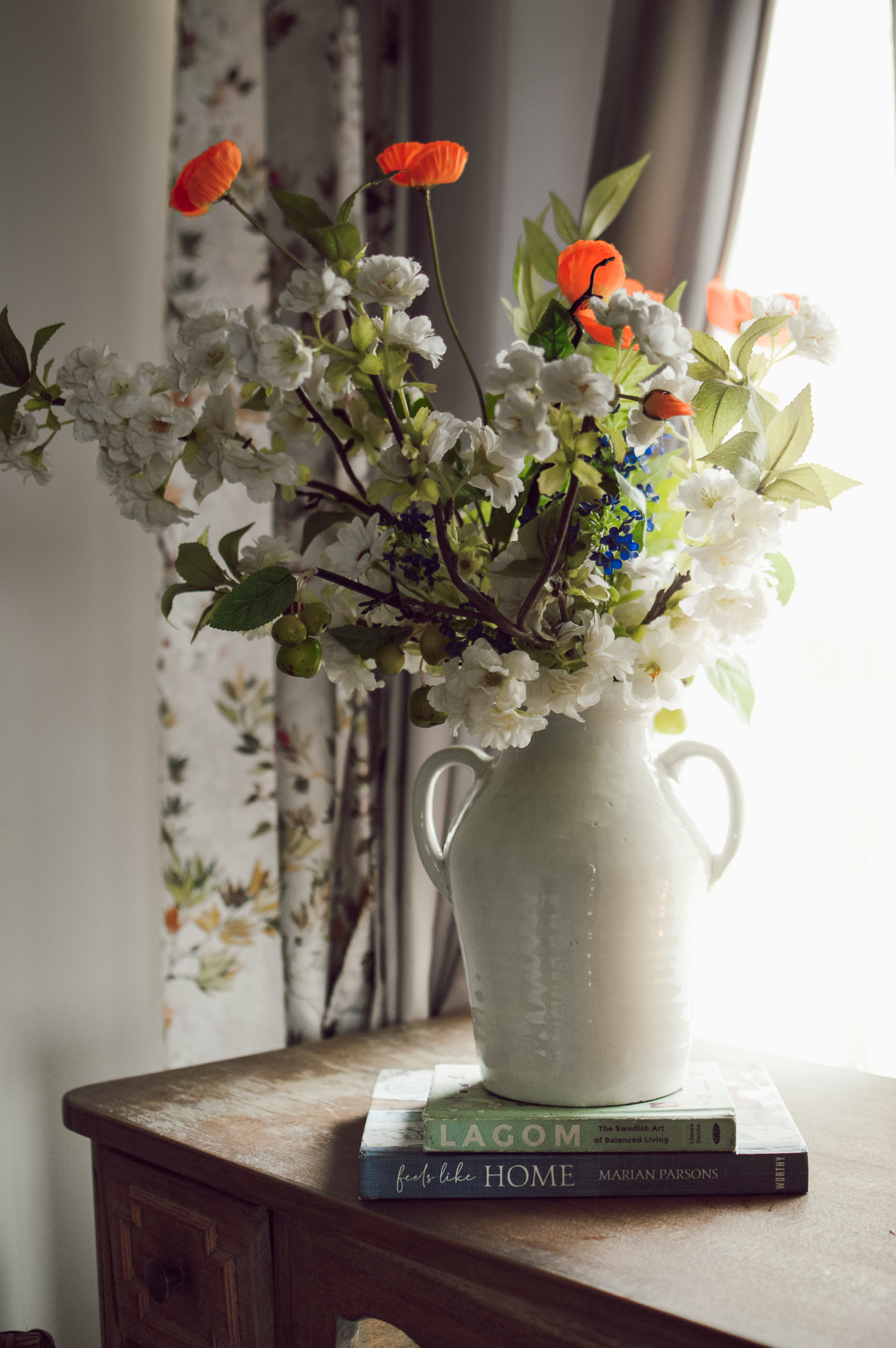
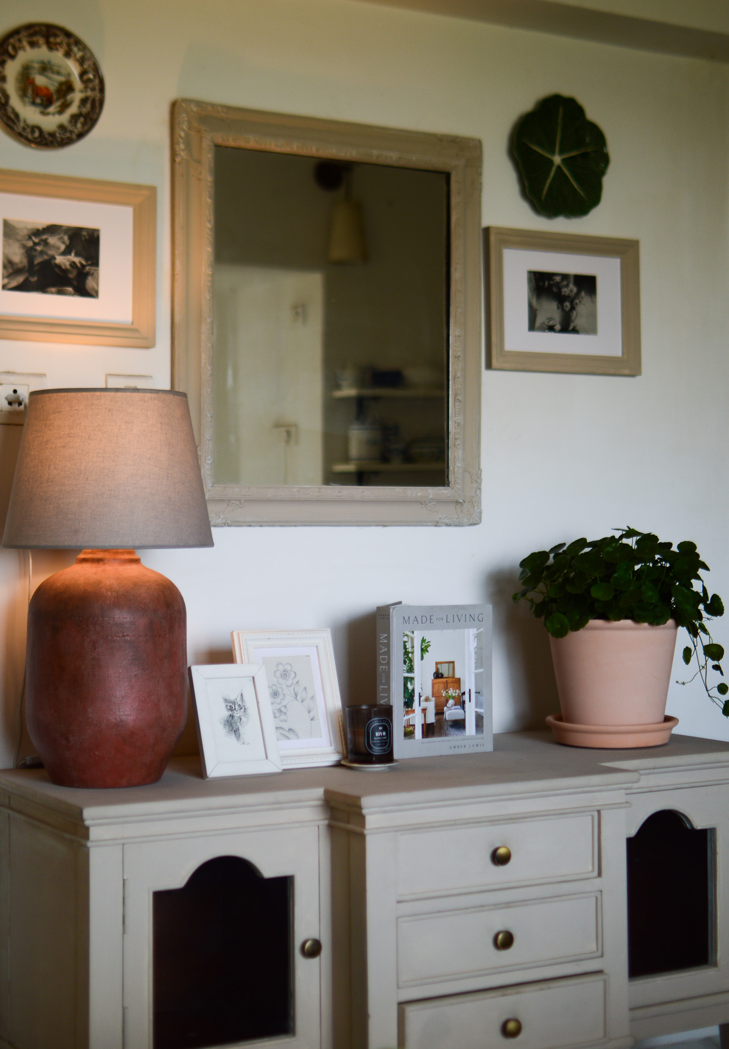
I particularly like using more blue around an area that has one accent piece in blue. Ofcourse, a personal choice and not a hack, and yet it seem to work every single time! My winning trick is using books that has covers in the same color palette as the cushion covers/drapes. They add just the right amount of color, weaves the colors in and around that area and also look less formal than a dedicated decor piece. Ofcourse I wont leave a pair of books like that, would I?
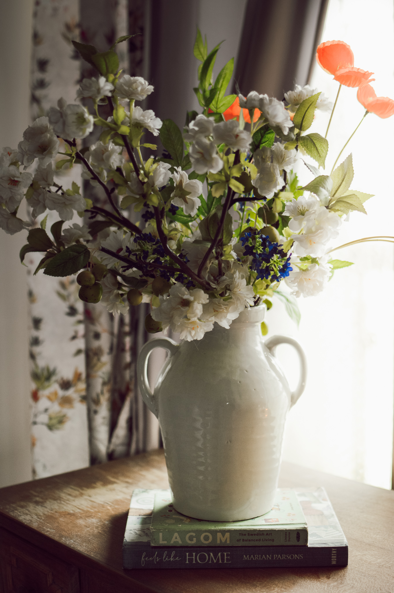
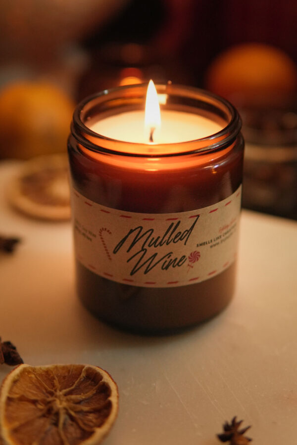
Go on and add a bunch of flowers and candles on top of your books to turn it into a pretty vignette. Used up the Amphora vase here which brings in elements of classicism to design. Love the traditional shape, the dual handles, the finish and the glaze! I can almost see this sitting pretty with a bunch of foraged leaves! A reel? Perhaps.
For now, here’s a study in blue!
Love, Rukmini