Monsoon Home with Urban Ladder‘s beautiful line “India Modern”, and how to don “Indian Chic”, rocking greys and mature pastels against the great grey nimbus sky . That is our topic of discussion in this house today and I am quite excited to show you all how our Monsoon home turned out.
I know. I know. From my words it’s quite unclear as to how grey on grey will even look {some of you must be cringing by now} but trust me; there are few colours as classy and versatile as grey, and grey on grey in a match made in heaven. Plus, we’re throwing in a bit of mature pastels {by which I mean muted shades of bright pastels and candy colours} which binds the greys and the whites to a comfortable mix which nudges you to sit by the window and enjoy your monsoon home. Take a look as to how it all shaped out!
The dark clouds be rollin’, we be chillin.
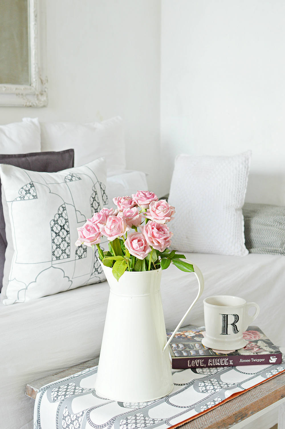
So how did this all come about?
While I was pining away, wondering what to do with my monsoon home on a hot May day- and I wanted to venture a bit away from the nautical/coastal patterns that I do- Urban Ladder launched their exclusive in house design line “India Modern” and “Happy Ink”, practically sweeping me off my feet. Too bad I had a meeting and I could not attend the launch {yeah, talk about life’s disappointments} but I did get a chance to look at their design lines: a glimpse and I was already telling myself, “that’s probably a good pillar to build the decor around”. Remember, pillars are something that you absolutely do want in your decor. The love is clear then? oui?
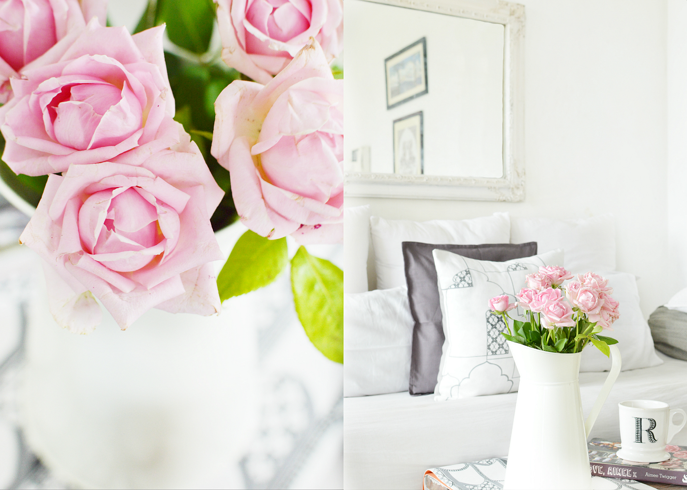
The Indian Chic Push That led To A Monsoon Home
You see, I have never done Indian before. I might have pulled in a bit of orange or yellow at some point in Diwali, but I have never explored Indian designs in its fullest sense. Thoughts bounced and boomeranged in my head, tossing invisible smears of possibilities. But nothing happened until a massive push came in the form of a Runner, a set of cushions and curtains!
While I was still dwindling with my monsoon home dilemma- the good guys from Urban Ladder sent me a little something from the “Amer” design series, thereby and totally concreting my plan of adding a bit of Indian in my home. I think they are also the first ones to actually make me incorporate Indian in my coastal decor.
The re-interpretation of the intricate detailing of Rajasthani fort architecture is to die for, and the sober greys effortlessly transforms a design style that’s so difficult to tamper with- and keeping the roots deep within culture- to a mix that not only perfectly describes modern India but also plays flirtatiously with the sea kissed colours!
You know, when I see a good design; a good re-interpretation, I get an adrenaline rush. Yes, the same one that you get while playing the newest version of GTA with VR glasses 😉 And styling with the “Amer” series from “India Modern” was an absolute pleasure.
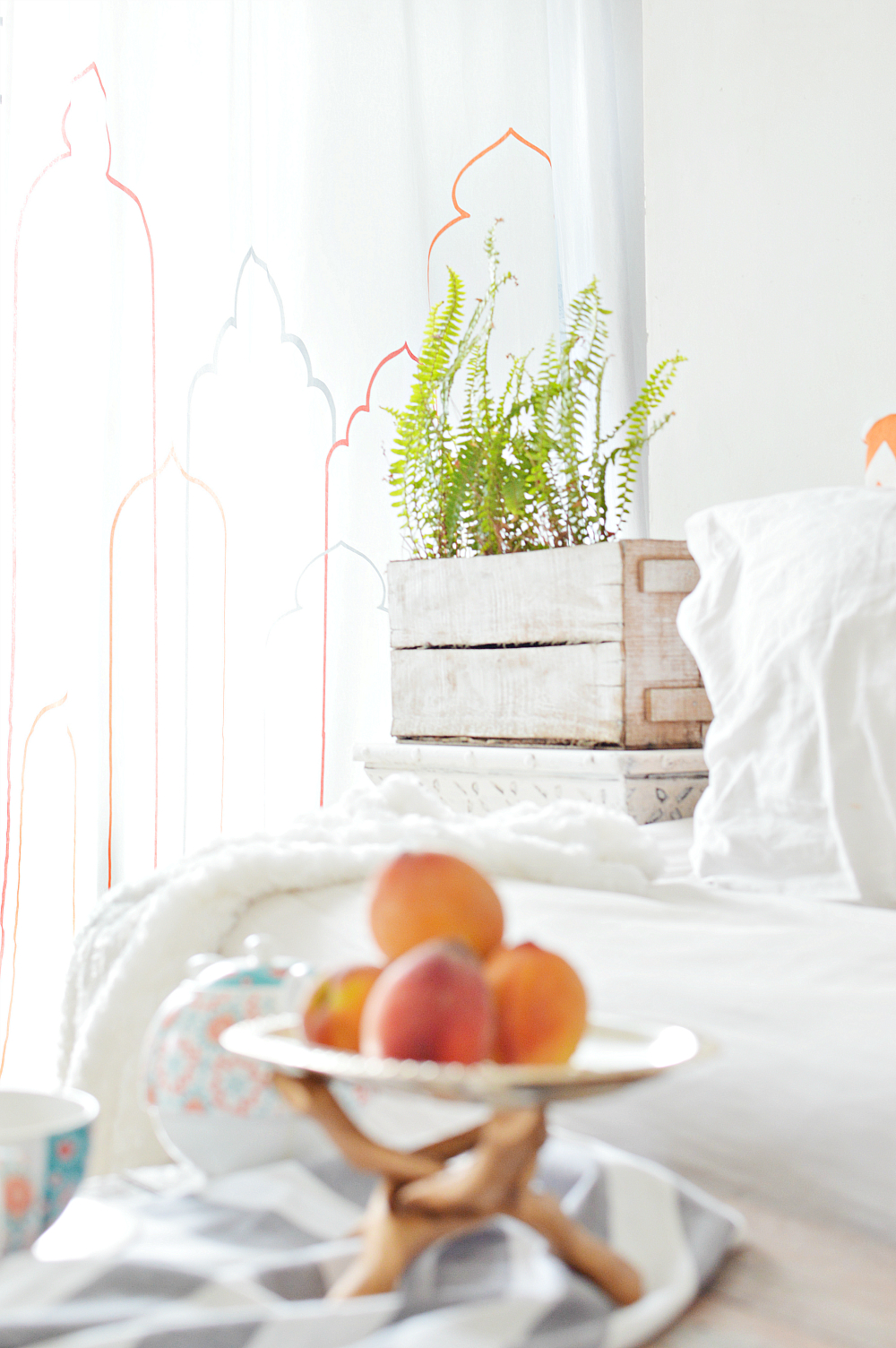
“There are customers who adore traditional, but love it more with a touch of restraint. There is a design style that veers more toward a cleaner, more minimalist sensibility. This is for them”- Tina Roy, Design Lead, UrbanLadder
I think she has addressed a very crucial point here! And I am glad someone finally said it!
If you know me, you’d know by now that I am a stripe and light linen kinda person, and I hardly incorporate traditional Indian designs. Why? Because my home doesn’t comply to the design sensibilities that India has to offer? Not by miles. It is for the sole reason that I do love my traditional with a bit of restraint. Yes, cleaner and with a minimalist sensibility. I am not into a riot of colours and blinding traditional patterns that quickly translates to clutter. I think it’s this very treatment of Indian patterns that kept me away from it. But see what happens when the same design/patterns are treated differently! They form a fine marriage between coastal colours and Indian design aesthetics that effortlessly celebrates India’s rich architectural and design heritage in a modern, beach style setting. I am one happy camper in my monsoon home.
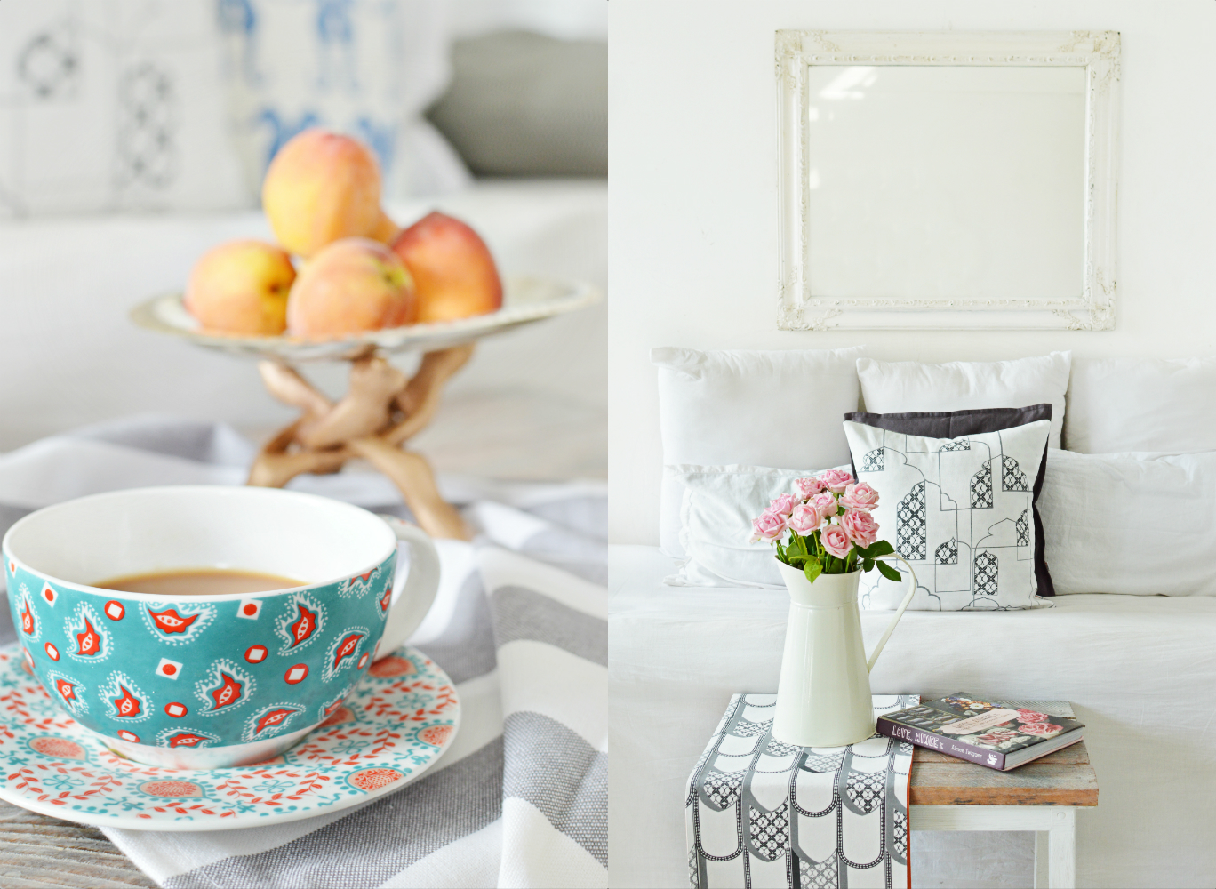
A Minimal Monsoon Home Colour Palette
Okay, that’s the story of the pattern. What about the palette? patience little one! I am getting to that.
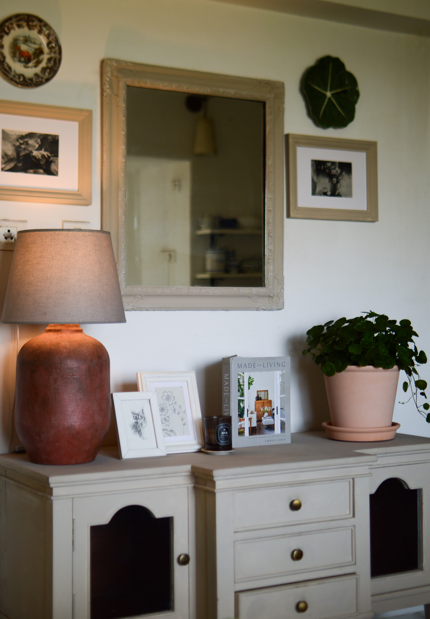
When I was packing away my summer essentials and looking out to dress the home for rains {my dress however stays the same}, I first thought of doing a bit of brights for a change. It’s only natural to brighten your space up when the skies are grey. It does look cheerful, I agree. But somehow I was opposed to “driving the greys away” and more into embracing it. We love rains, we love shade so why shouldn’t we embrace the outdoors as a giant canvas and paint our tiny homes in colours that accentuate it? Shades of grey to go on grey with a bit of white/ivory and pops of colour here and there that binds the big nimbus sky? No?
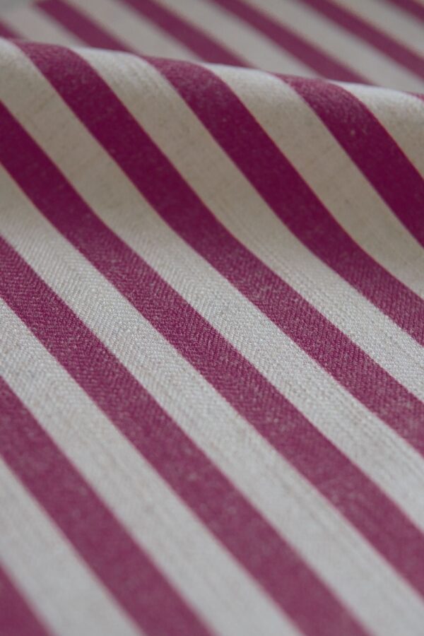
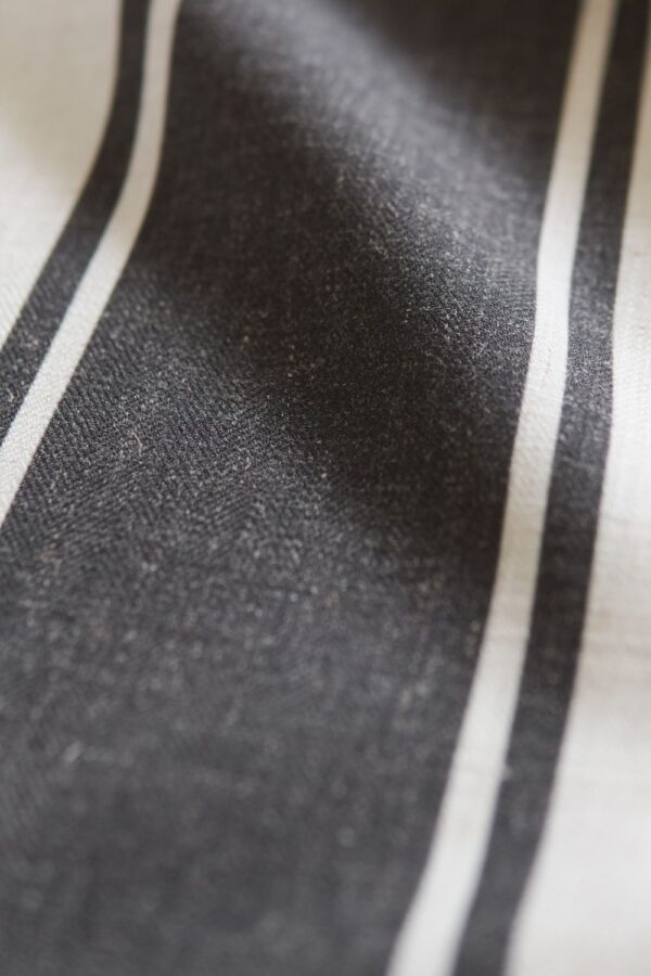
Obviously, the runner, cushion and curtains from the “Amer” series {I chose the simple grey on white sans colour. Amer also offers similar designs with colour- whether outline or filled} made the decision making a bit easy and I found myself building a story with white, grey, pale tangerine, washed indigo, pink, a tiny bit of turquoise and a dash of charcoal. The result is right in front your eyes, for your perusal.
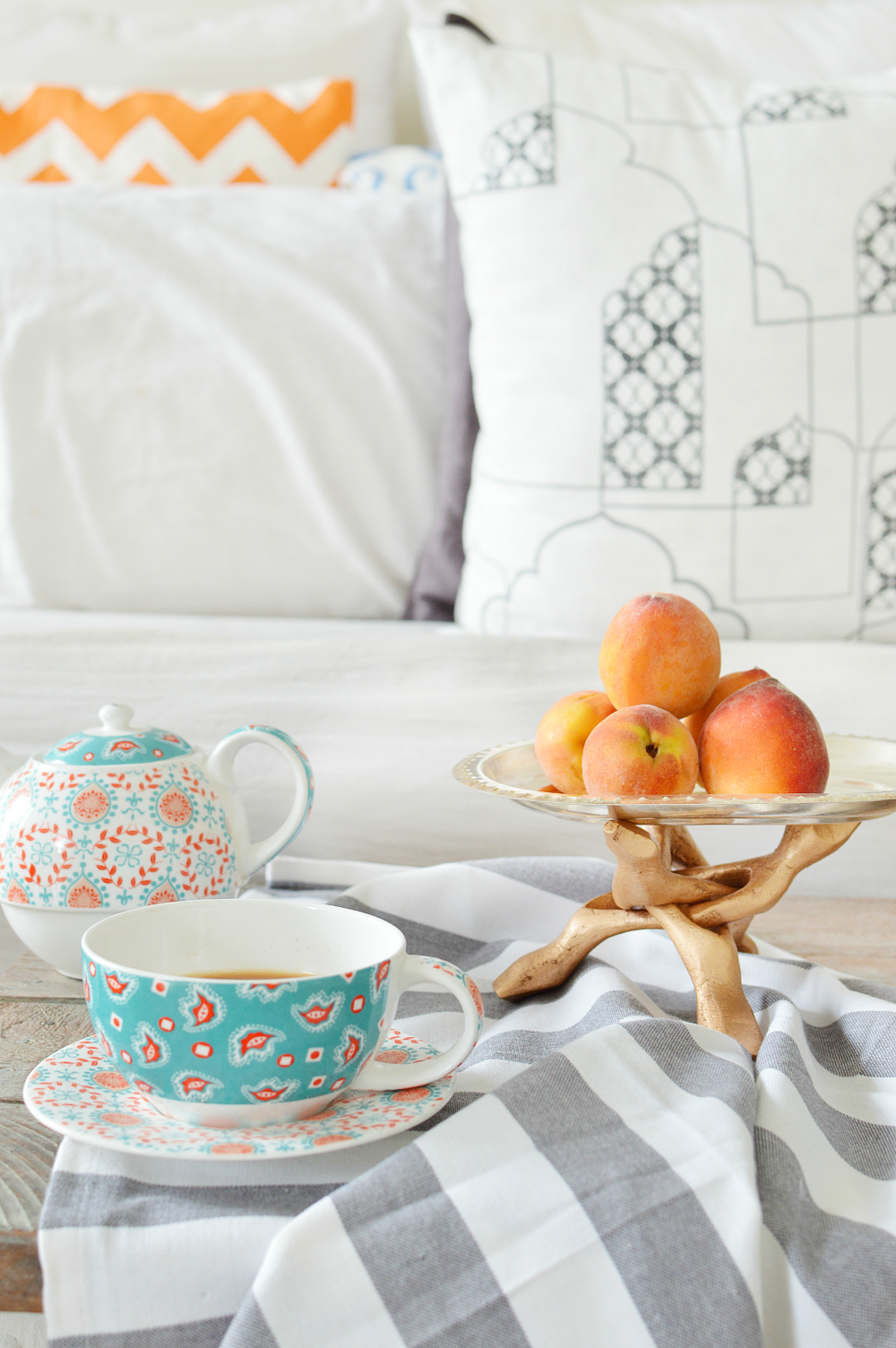
You know, if I say so myself, I love how it all turned out. But then again, I think the Amer series would look equally classy in a purely Indian setting or a modern, clean setting too. Quote me on it, you could do Parisian Chic with it too- just get in a whole lot of dark pink, charcoal, gold and checkered. What a versatile range! Shocker of a design and I say that in a good way!
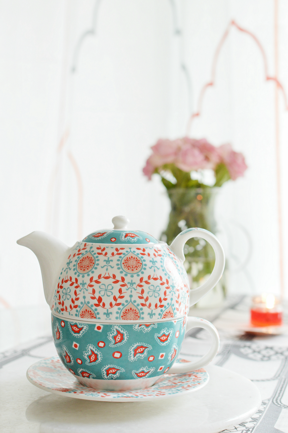
Just so you might know, Urban Ladder launched a few delicious series under “India Modern” and “Happy Ink” and not just ‘Amer’. If you love intricate designs and a block of colour, check out the ‘Tree of Life’ which is my next favourite range. Interpreting extraordinary growth and fertility, as earlier seen on Mughal art forms, in contemporary colour block- The Tree of life is just as stunning. Totally love the indigo one! This is from the “India Modern Series” btw.
As for “Happy Ink”, “a range for the “offbeat, quirky and vibrant, The Happy Ink Collections brings ‘Doodle Man’ and ‘Owl Prowl’ to life. Doodling is perhaps one of those rare art forms that allows us to create infinite possibilities with a single black line. The ‘Doodle Man’ designs use a mix of monochrome patterns and visual textures with bright accents to highlight the playful, spontaneous side of life. Inspired by the bird of prey, the ‘Owl Prowl’ designs feature assorted prints in vibrant hues. Bold, graphic and unconventional, this collection is ideal to add a pop of colour to any space.” I am quoting UrbanLadder here.
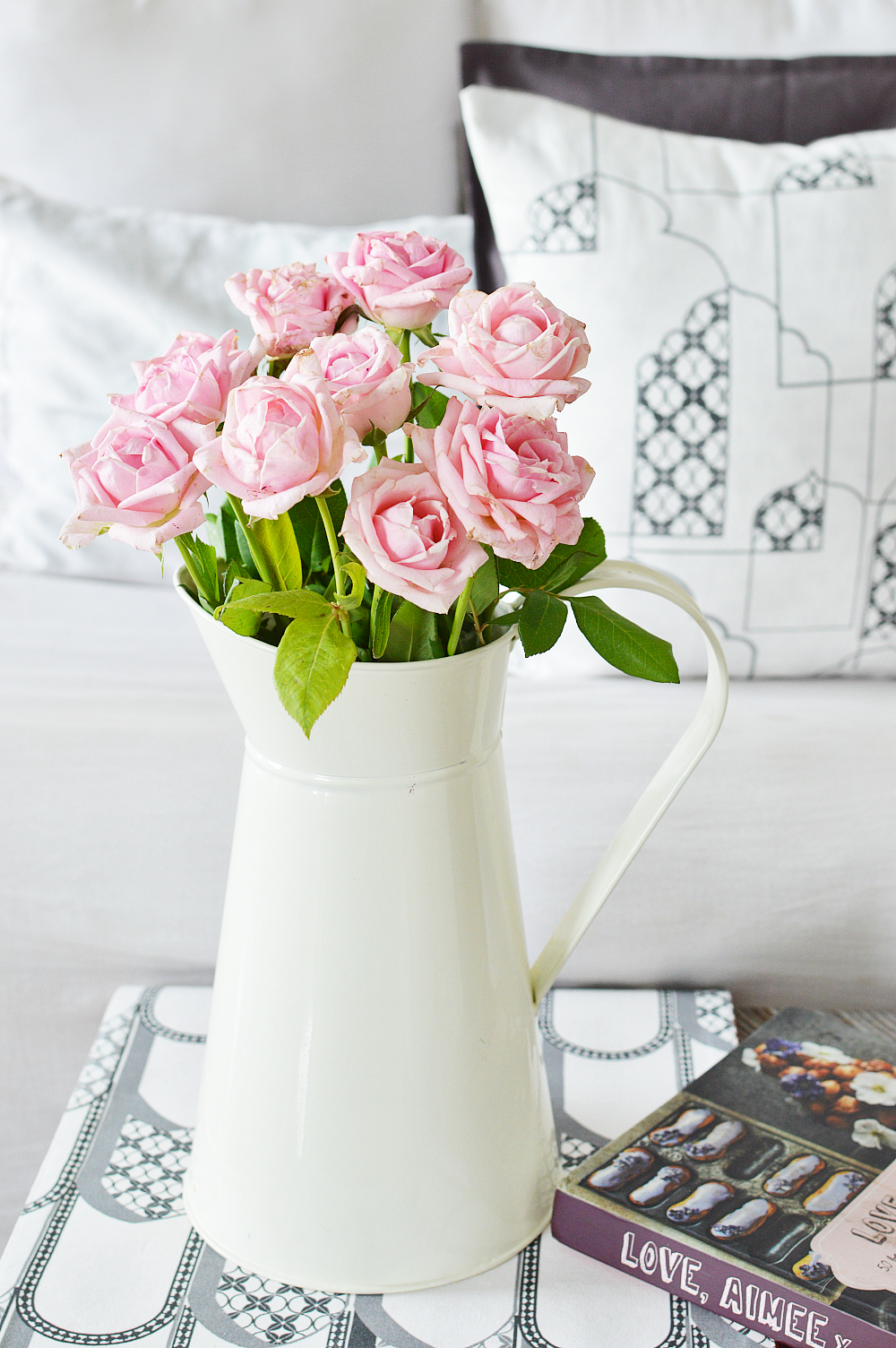
So, yes, if you are planning on a monsoon home overhaul, do look into my colour palette incase you would like something sober and relaxing. And certainly give UL’s new line a look: I have a feeling a lot of you will snag the colour filled “Amer” line: It’s just fantastic.
Shout out as to what do you think about the new decor direction and tell me if I’ve succeeded in getting in a bit of Indian Chic in beach house style. Leaving you all to explore and a whole lot of decor dreams.
Rukmini XO

