Hello Sunday, the beautiful day and to you wherever you are! How are you doin’ in your neck of woods? And ofcourse, now that spring is officially here, where you headed?
As for me, I am colour trippin’ this spring. The folks at Asian Paints have been kind enough to invite me over to the Asian Paints annual colour forecast, an event which predicts an upcoming year’s colour trends and sets up a springboard for design ideas, Colour Next 2015 to celebrate the launch of Asian Paints colour of the year and I am very excited to spill it out to you that ‘Coral Radiance’ it is!
Now you’d be wondering why is she all hurrah? Because, I have been eyeing coral for spring-summer too! I know, I know. It was supposed to be Marsala but personally I was envisioning a lot more coral and yellow this summer with lots of white, touches of stripes in grey, seafoam, powder blue or black and a bit of copper to accentuate it all. I am elated to see my colour (read: coral) sensibilities are in place.
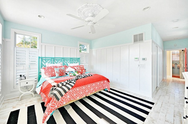
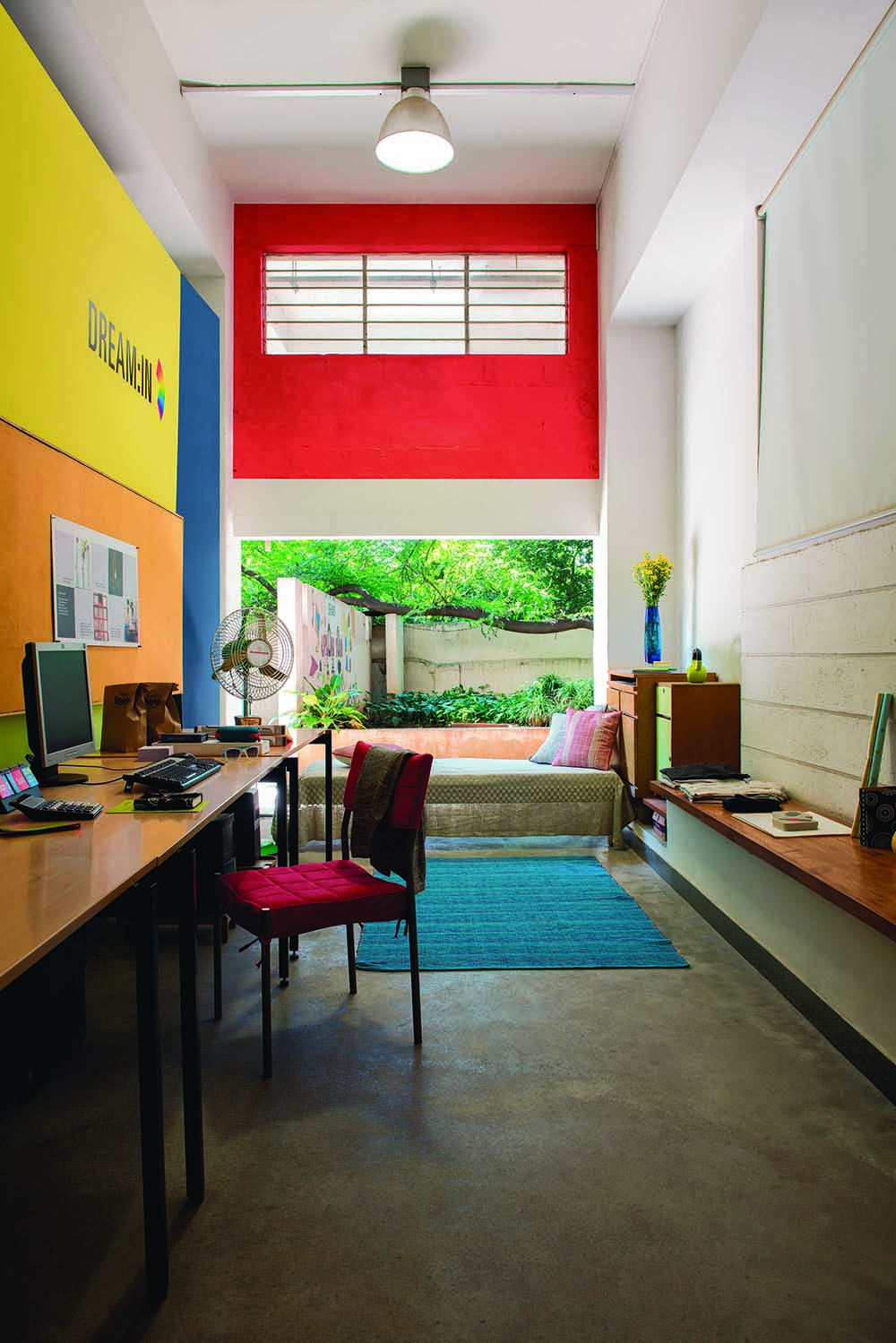
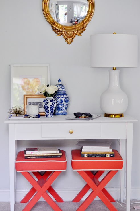
Now, this is my kinda coral! Can’t wait to add touches of it! Also, note how versatile the colour is. Up top, it binds the elements of a modern-antique decor quite seamlessly while in this little beach house it’s best friends with monochromes, turquoise and sea-foam. Not so long ago, I wrote an article on Coral Decorating Ideas and I will stand by what i said:
“Gorgeous in its own right, this savvy cousin of orange is young and mature; energetic and calming, lively and yet serene. Just when you think you have figured all the possibilities out is when another striking character unfurls. Funny right? You know the colour but you cannot define it, it just looks beautiful everywhere! This very quality of unfathomable brings in romance in coral and I am head over heels in love with it.”
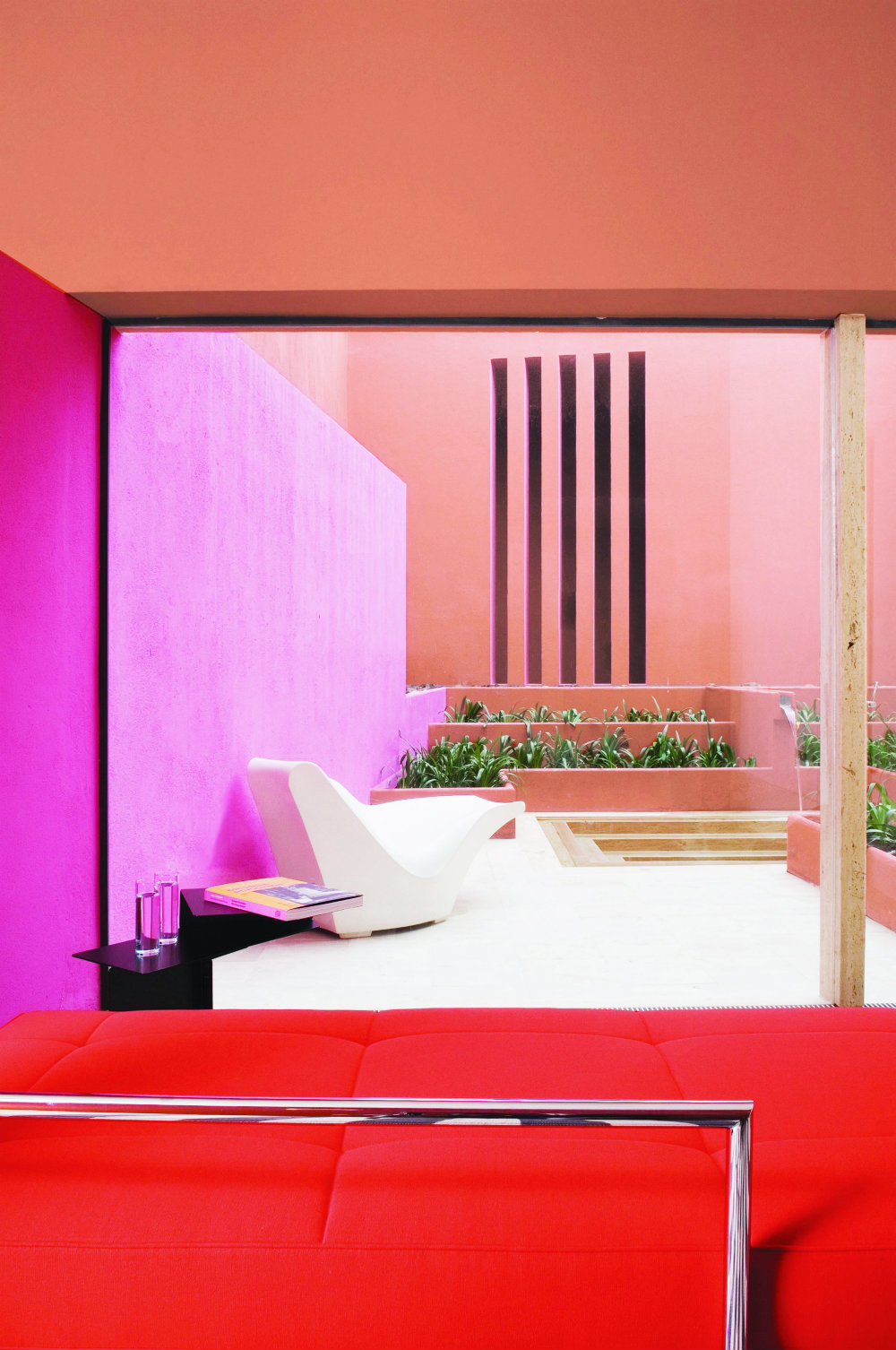
See what I mean? Coral, pink, red and a tiny bit of neutral makes this space a zesty retreat. It is just as good with a beach house, as it is with modern-farmhouse, as it is with contemporary Mexican. As a décor enthusiast I am convinced that no matter what your home theme or colour is, coral will go with it! It is totally justified, the fact, that ‘Coral Radiance 2015’, the experts felt, has the passion of red and the cheer of yellow and its inherent warmth can galvanize the space where it is used. The colour with its positivity and longevity made the cut as the perfect colour for today’s times.
I am really thinking of putting touches of Coral in this wee wannabe beach house. Think I have some empty tin cans and some extra fabric 😉 {Keep guessing}
But that’s not the end, ColourNext, like always, also launched four trend themes with corresponding palettes which will reflect the moods of the coming year:
‘My City My Home’– a trend about reclaiming ownership of public spaces and redefinition, the lead palette of Coral Radiance, Oyster Grey and Royale Play Torrent captures the spirit of responsibility, action and pride.
‘My Free Will’ – focuses on the inherent need to make independent, informed choices, giving the space a sense of expanse and sophistication.
‘No Pun in Ten Did’ for the irreverent few who love surprises and smart humour. Colours dominating this story are a clutter breaking pink accentuated by interesting finishes and textures.
And, ‘Start Up’ – a palette for the new self-confident Indian filled with courage to follow their passion and make that into their independent career.
Just so you might like to know, ColourNext is the annual colour forecast by Asian Paints, and is now in its 12th year- its first year being 2003, and as Mr. Amit Syngle, President-Sales, Marketing & Technology, Asian Paints Ltd puts across, “Colour Next is the outcome of a journey across India to gauge the subtle changes in societal behaviour that impact decor behaviour. In its 12th year, Colour Next is acknowledged as one of the most comprehensive colour trend researches around.”
But then again, why precisely coral? why my free-will, no-pun in ten did and start-up as palettes? What exactly inspired to come up with the palettes and the colours for the year?
He continues, “Progress” is a strong underlying sentiment seen in all sections of the society this year. Our Colour of the Year, Coral Radiance, reflects this mood perfectly, encapsulating in it the dynamism of moving forward while still retaining an innate Indian feel to it. I do believe that the trends forecasted this year, will provide inspiration to the design community at large”.
Well, Asian Paints, the palette sure did inspire me and I am obsessively dreaming coral. To begin with, this is what is happening the minute I lay my hands on a can of Coral Radiance:
People, here and abroad, what do you think? Would you like a bit of coral too?
Happy Spring, Happy moving forward, happy spaces, happy hearts. Stay colourful.
Xo