To begin with, I apologize. There are still some lines and bubbles that I have to straighten and I have told myself I will do it “aram se” because there are one too many. Maybe one wall each night or something, with precision. But barring that, the kitchen is done! And how nice does it look without the beige panels yeah? It is also 100% renter friendly. When you leave the house, just pull the wallpapers down, give it a good sponge rub with warm water + dish soap and you are good to go. No one gets hurt!
And this is the thing I like about renter friendly projects
It teaches you to work your way around a particular thing while respecting the original design. This also requires a lot more creativity as opposed to re-tiling or breaking which would be easier in comparison. In renter friendly projects you need to constantly think of the present and the future. It’s another thing that in our last apartment our home-owners wanted to keep every bit of the wallpapers and I was very happy to leave them as is. But in the event they wanted us to not, I could have used a day and pulled everything away without any hassle.
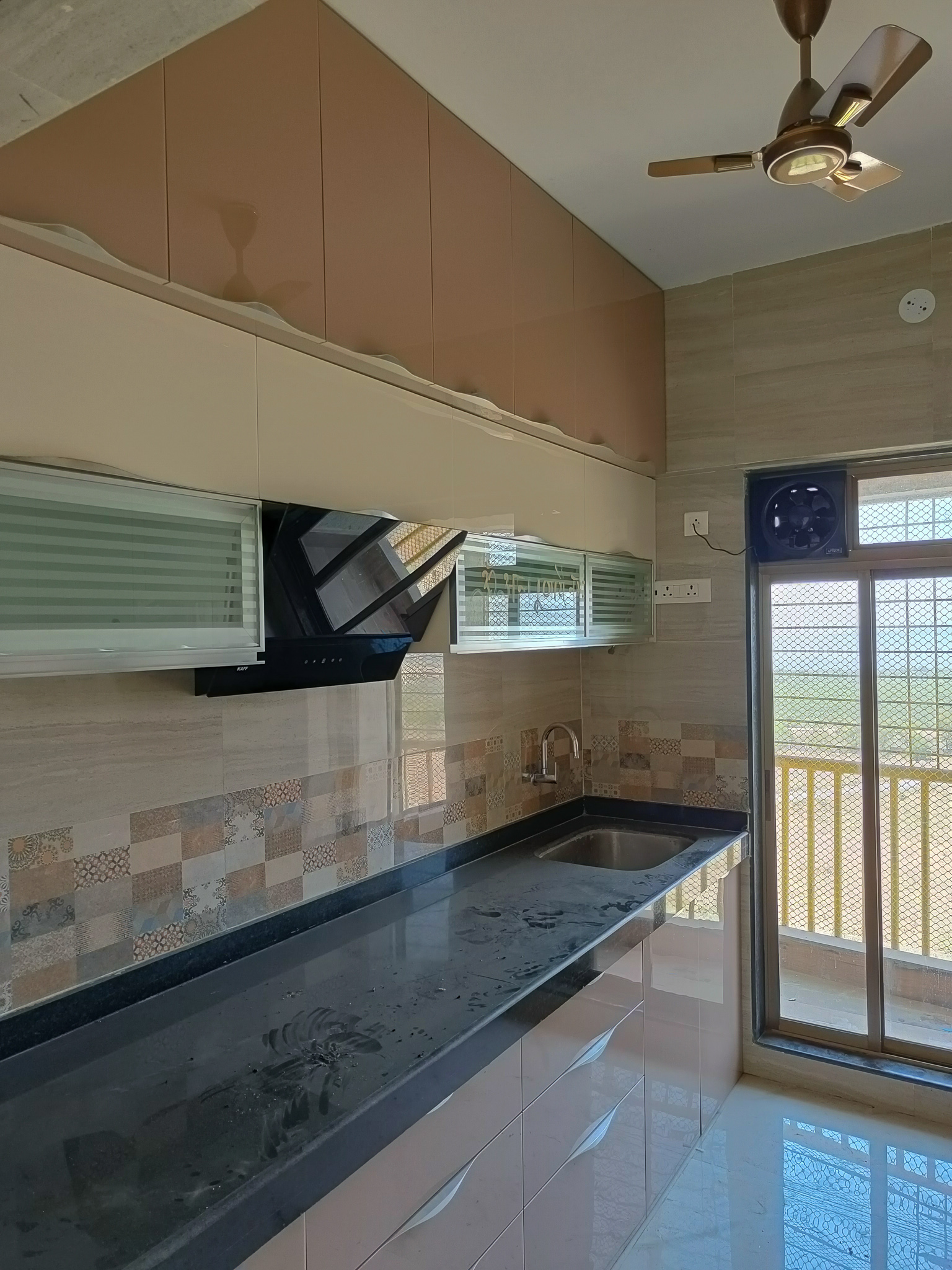
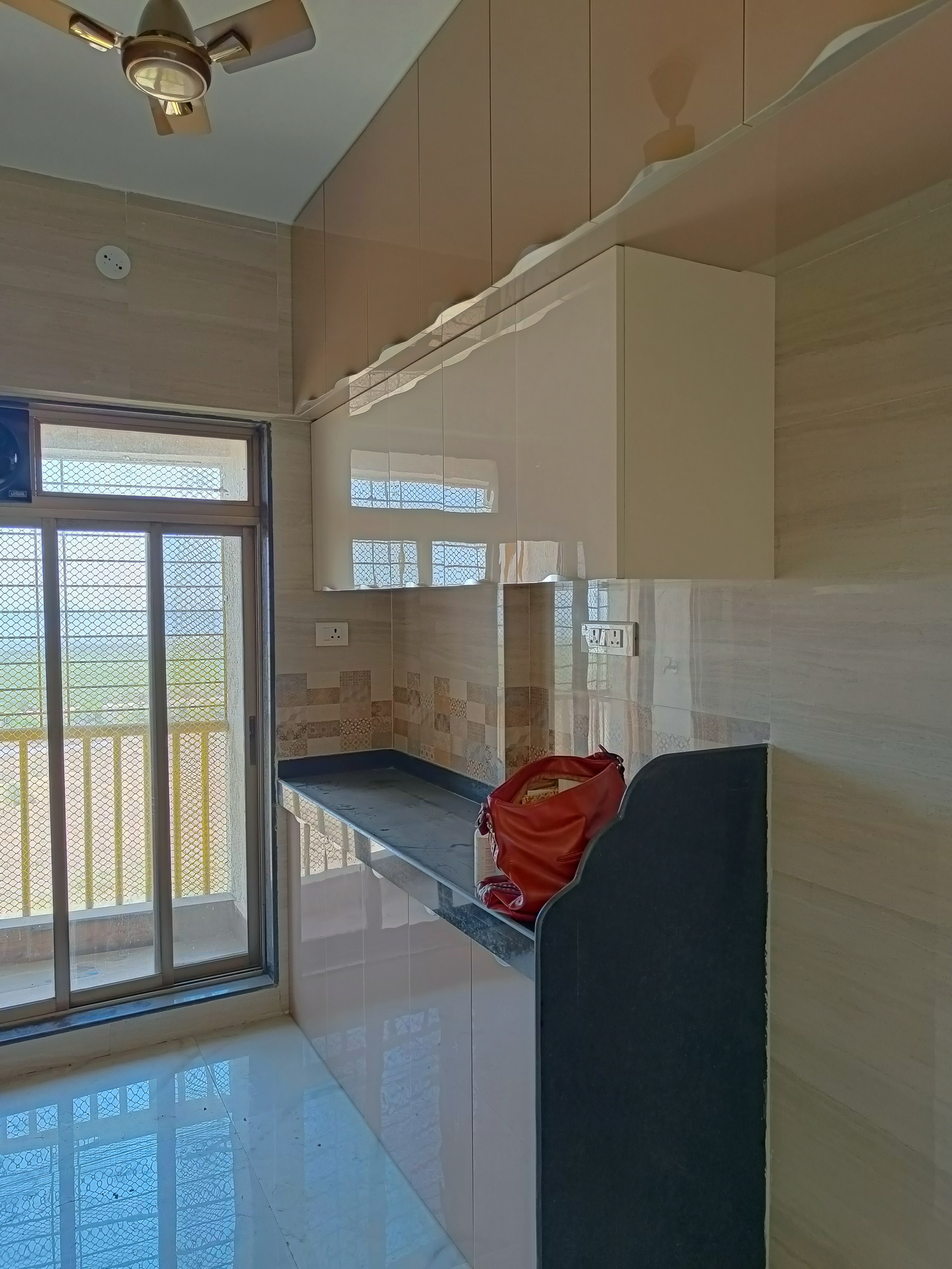
Last year, I discovered the magic of contact paper and I have been a huge fan ever since. When I moved into this house my one simple agenda was to change how the kitchen looked because while it was beautiful, it was not for me. I wanted a more modern-farmhouse approach, and a bit more light. In my opinion, the beige and sand with cream and silver pulls was kind of restricting light and my focus was all over the place.
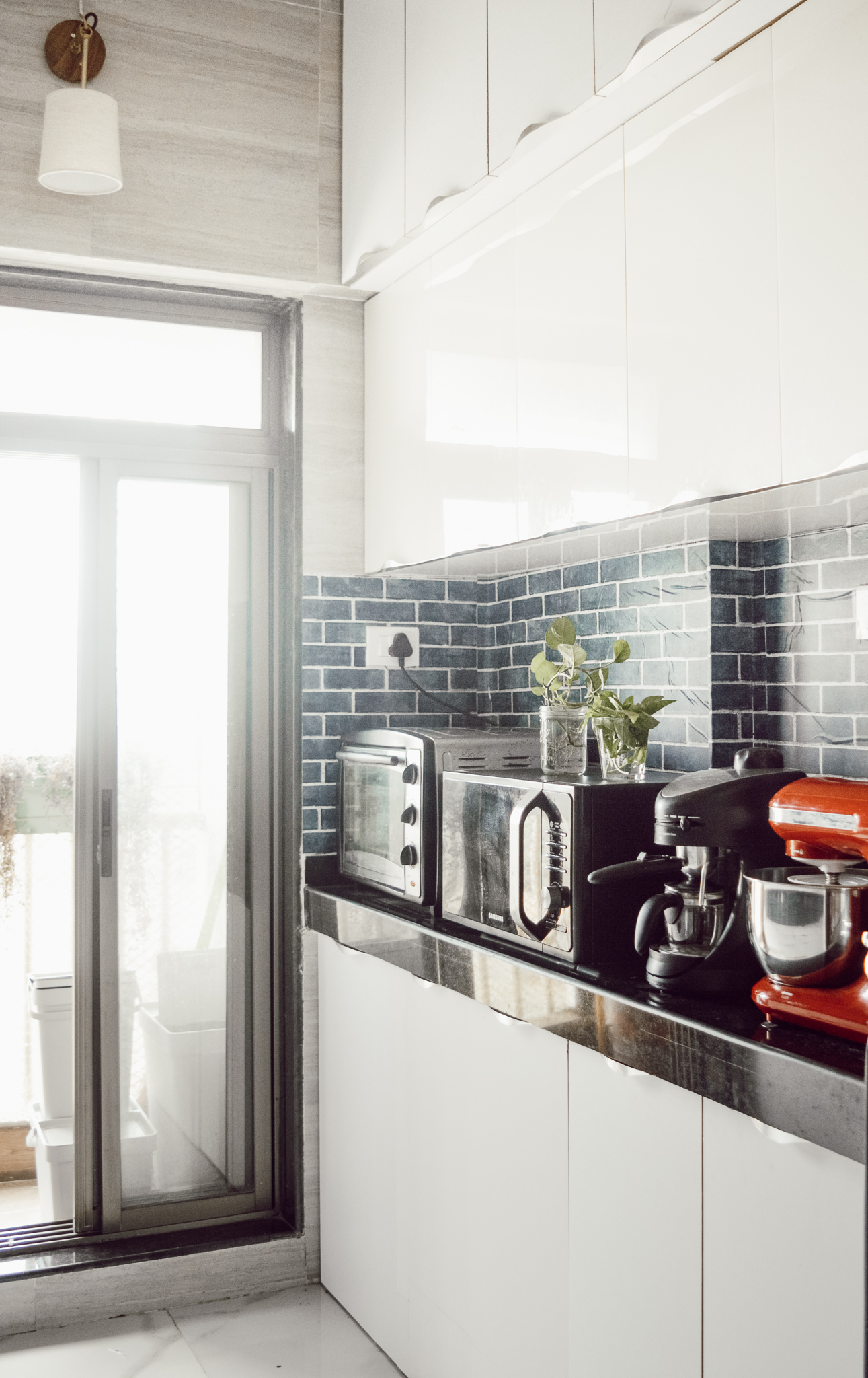
On the contrary, adding a bit of ivory and dark navy to the space opened it up. Because most of the light we get from that window is warm, a bit of blue toned the ambience down.
Here’s a side by side comparison of old and new kitchen

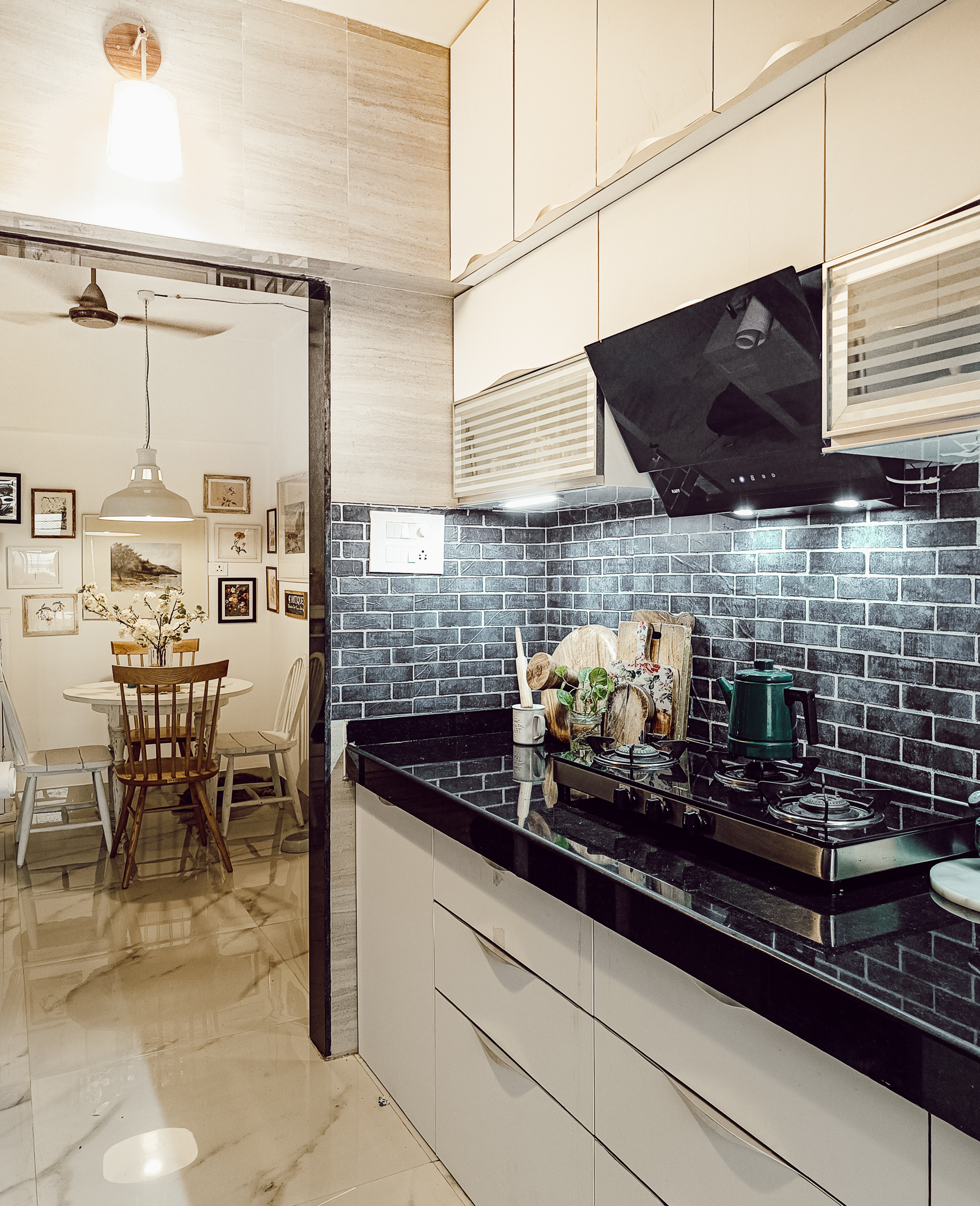
Here’s the other side of the kitchen
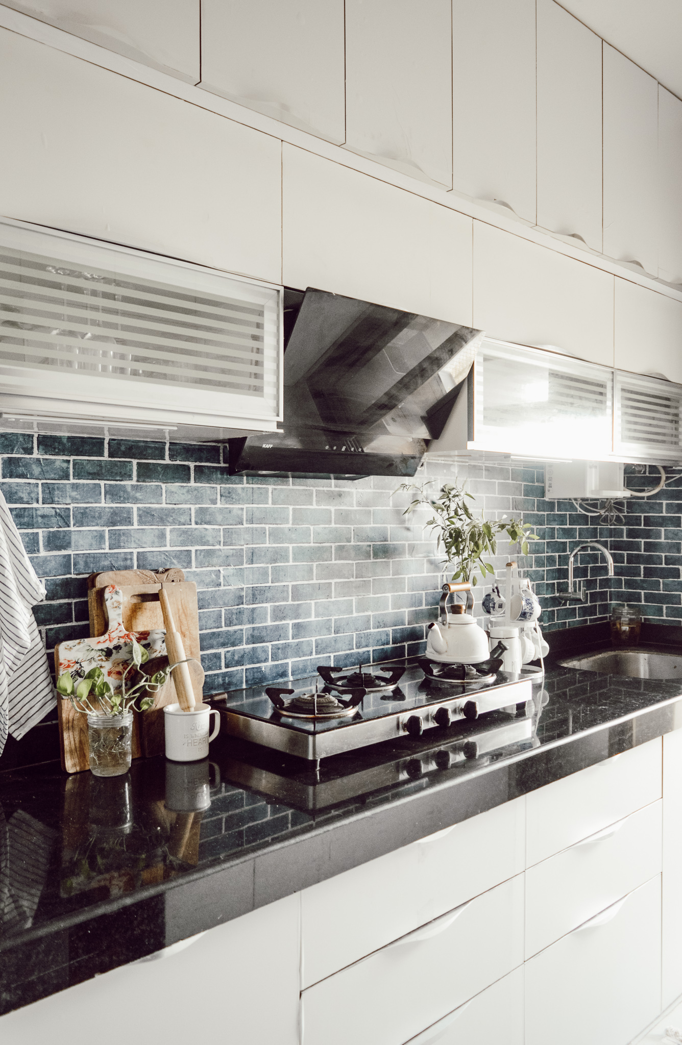
Like I said, lots of lines to heat gun and sort, by the time we reached here I think were just finito! Haha, but nothing unsolvable. However, you can see how it added a whole lot of sophistication and mood to this space. Sand + Beige + Black counter tops were doing nothing for this gorgeous kitchen.
Also, why dark backsplash?
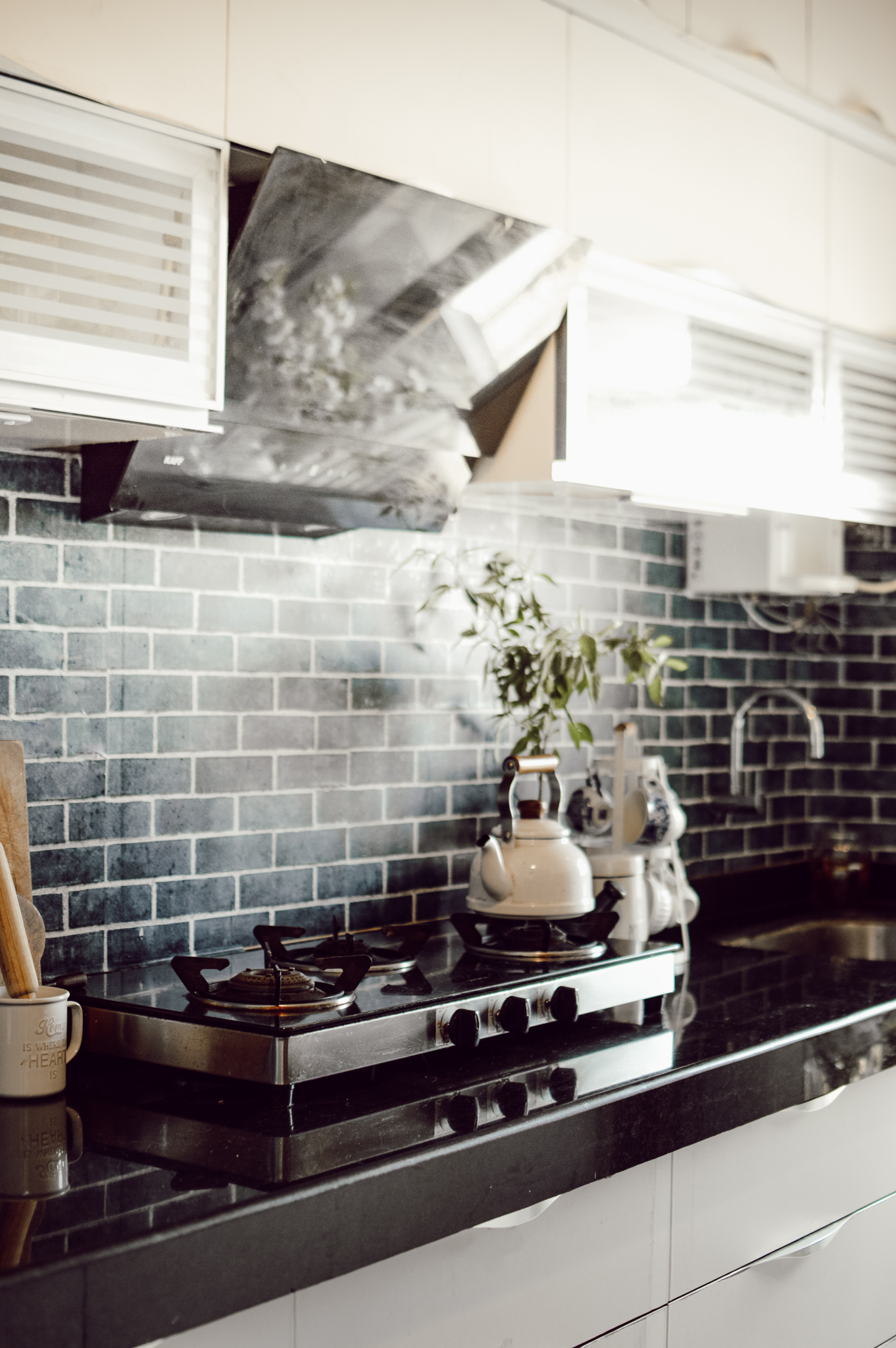
Not something I will particularly do because hey, I am the white-decor girl but like I said, with rentals one needs to work around the existing designs. In my last house, I had wallpapered the counter tops with a beautiful white marble pattern but if there is a slightest possibility that you will have house-help, don’t bother wallpapering the counter top. Pramila slashed through the whole thing. Hahaha. Like a samurai. Let the kitchen counter be granite. Its better that way.
So yes, coming to why a dark backsplash. Firstly, because if I have to do dark, I would rather do it in a way where the dark color in the countertop flows without restricting the eye. Not too stark. I would like to bring in lighter elements but I’d let the dark color fade in a little. So with the black counter tops I went with an ink blue backsplash with white brick design. They are both dark shades but the ink blue weans into the lighter cabinets thanks to the white brick designs. It also makes the dark countertop look a bit more classy than it actually is!
Lighting in the kitchen
A kitchen should be bright. Period. And this is also the only place I need white light because I would like to understand the color of the food better. For overall lighting we used brass pendants by Smokestackworks– a lighting outfit I am very, very fond of because they do absolutely gorgeous brass and teak lighting. In this kitchen there was provision for one light but we wired both walls to accommodate two of these!
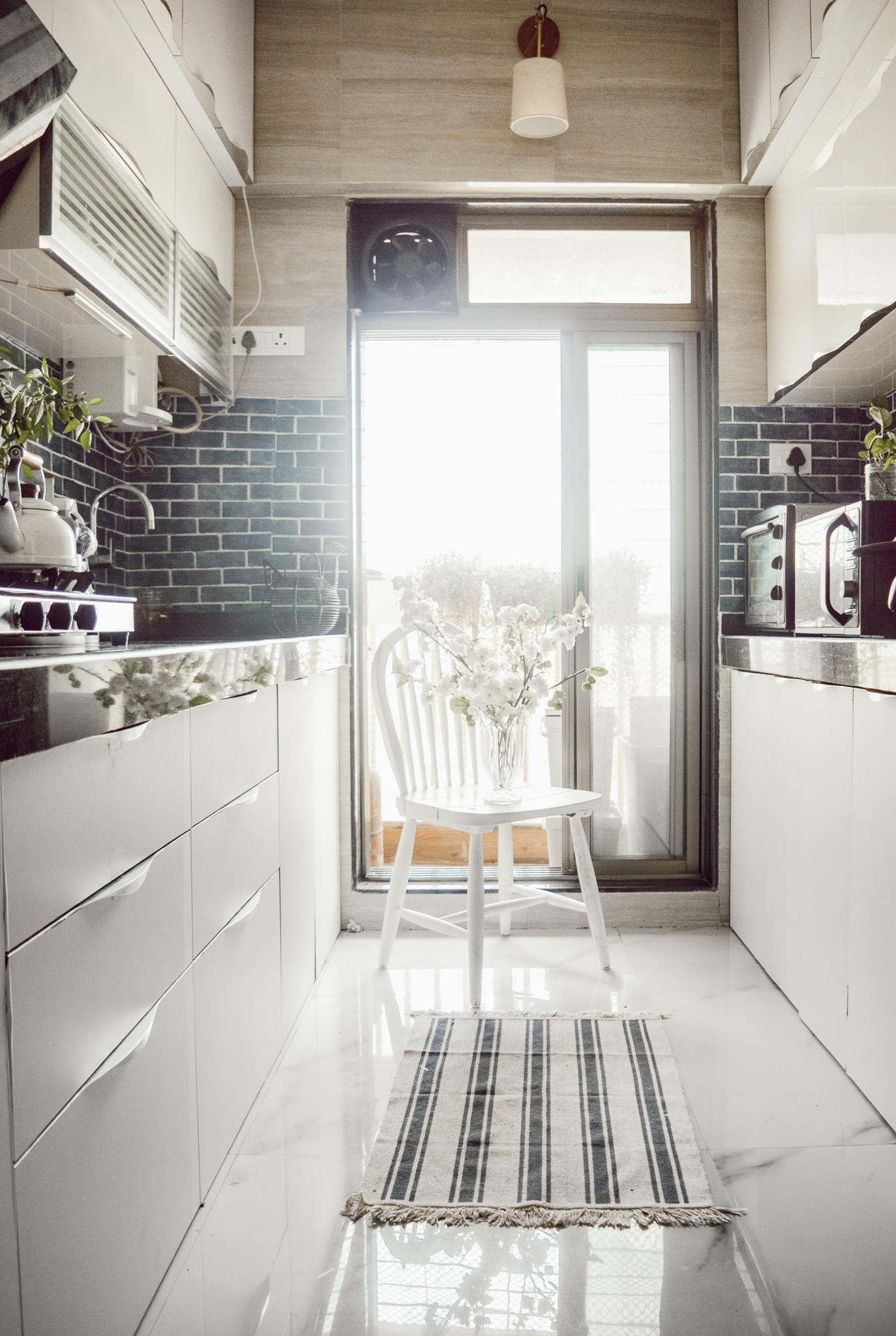
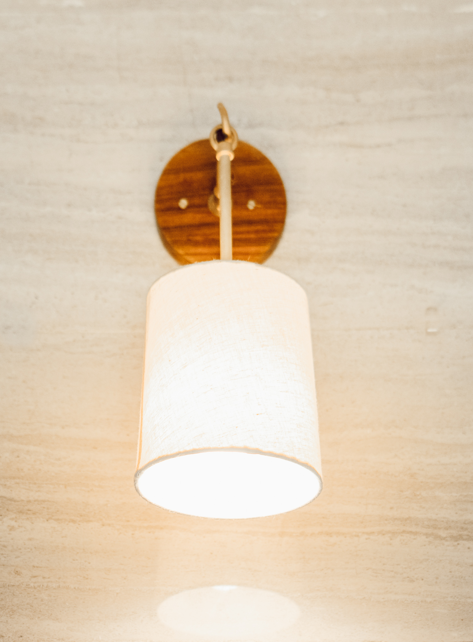
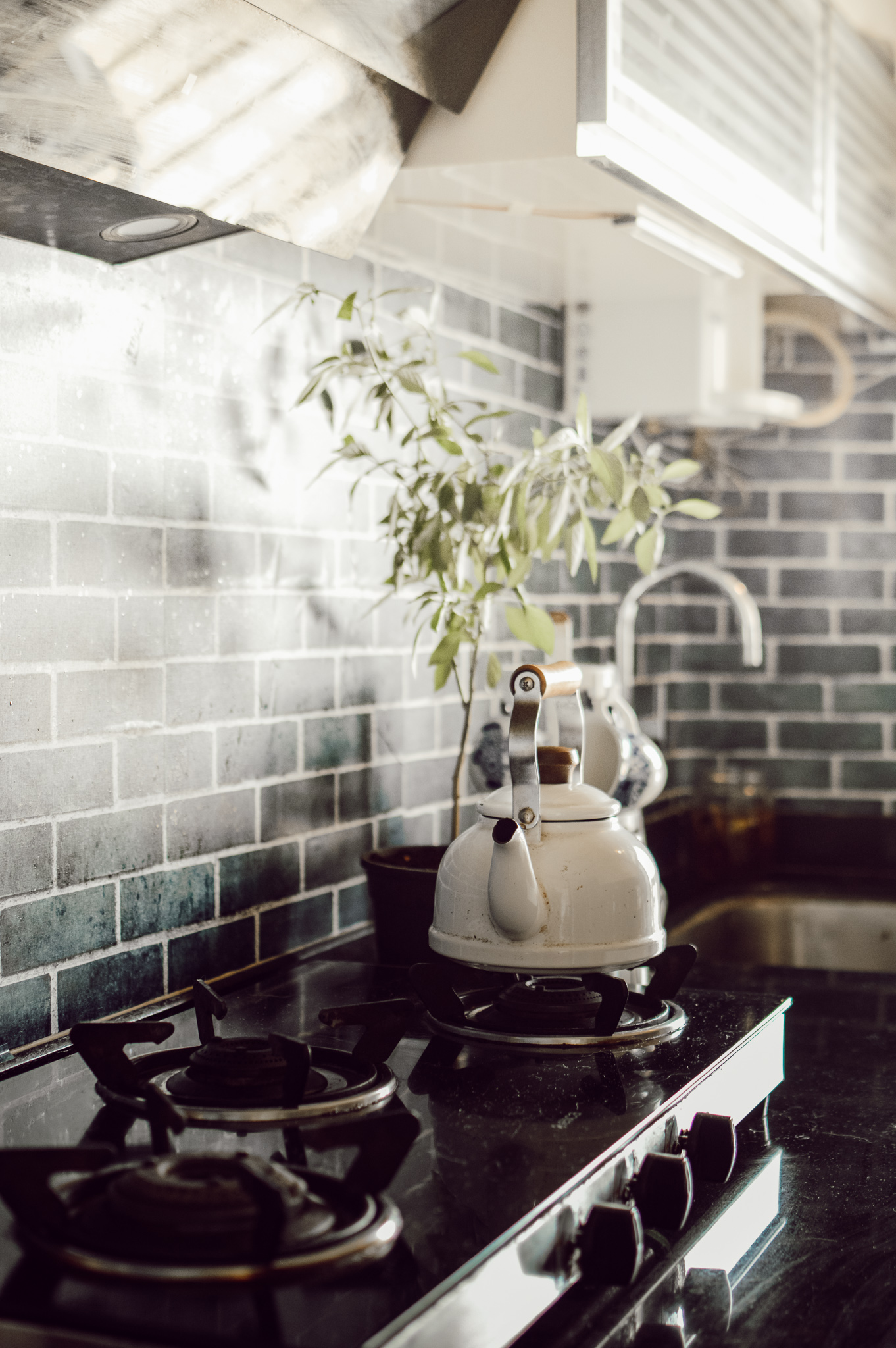
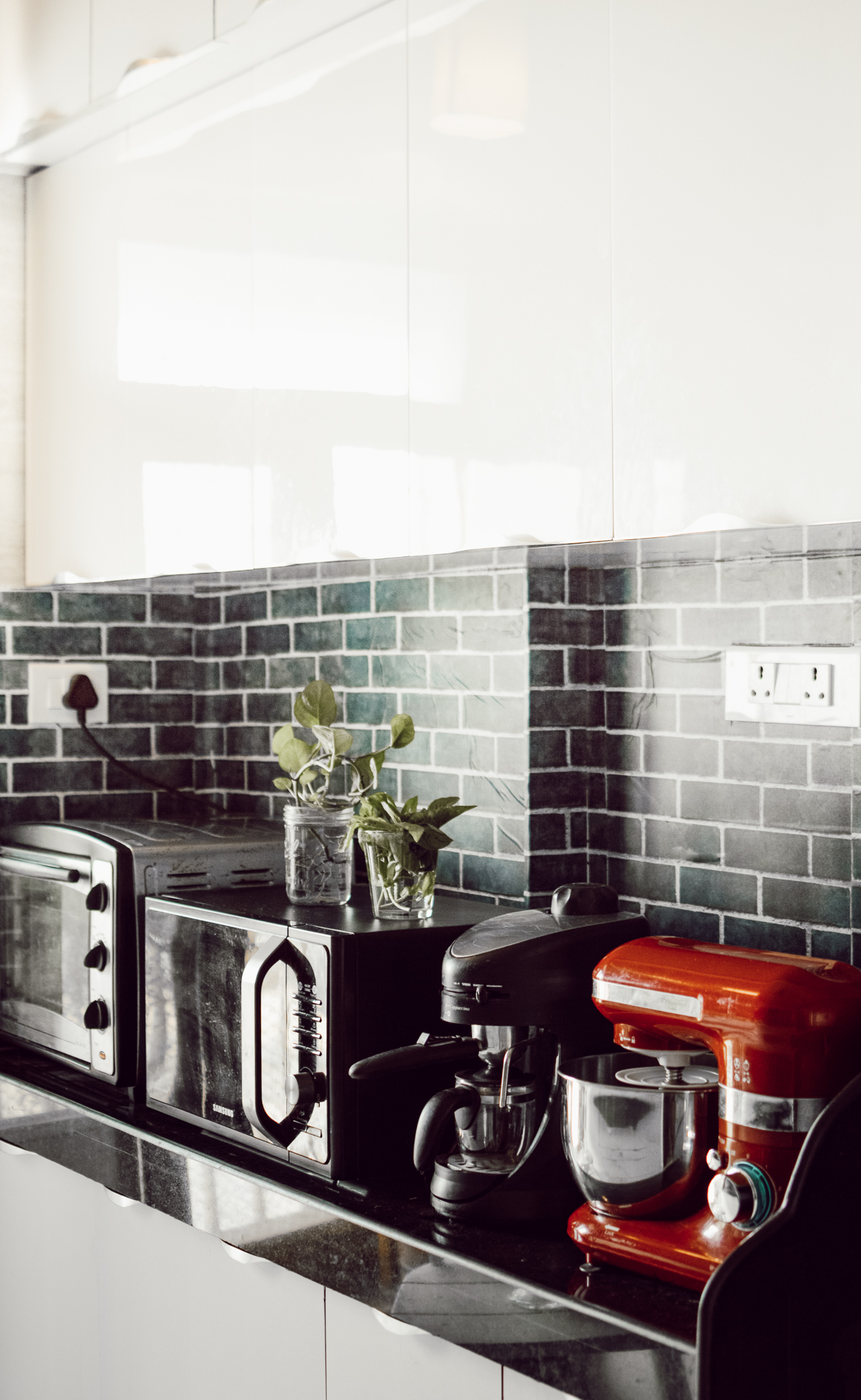
For the counter tops, I had two lights installed under the cabinet and our chimney comes with light too so I have a nice, bright counter top to work with!
Here’s a photo from my phone.
Links to the wallpapers
White auto wrap for the cabinets: Buy here
Ink blue brick wall backsplash contact paper: Buy here
Brass lights: Buy here
Rukmini
Hahaha, please do take 🙂 thank you so much for leaving a comment
Okay I want your kitchen…… the transformation is phenomenal and the vibezzzzzz, I’m all zen now.